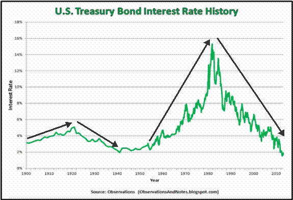
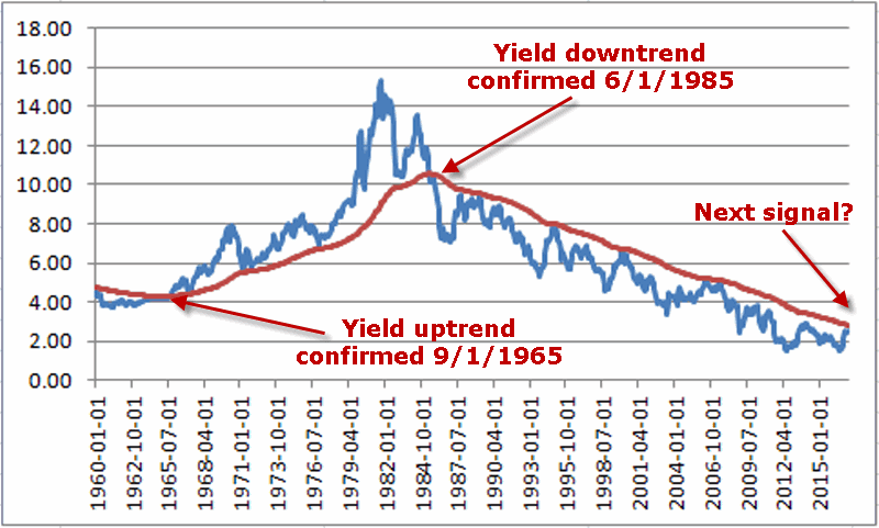
First things first: I am primarily a trend-follower (this is based on, a) the relative long-term benefits of following trends and b) my lack of ability to actually “predict” anything – but I digress).
As a trend-follower I love the fact that the stock market has been trending higher and the fact that there is so much “angst” regarding the “inevitable top.” Still, like a lot of investors I try to spot “early warning signs” whenever possible. Here are the four “things” I am following now for signs of trouble.
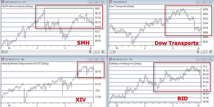
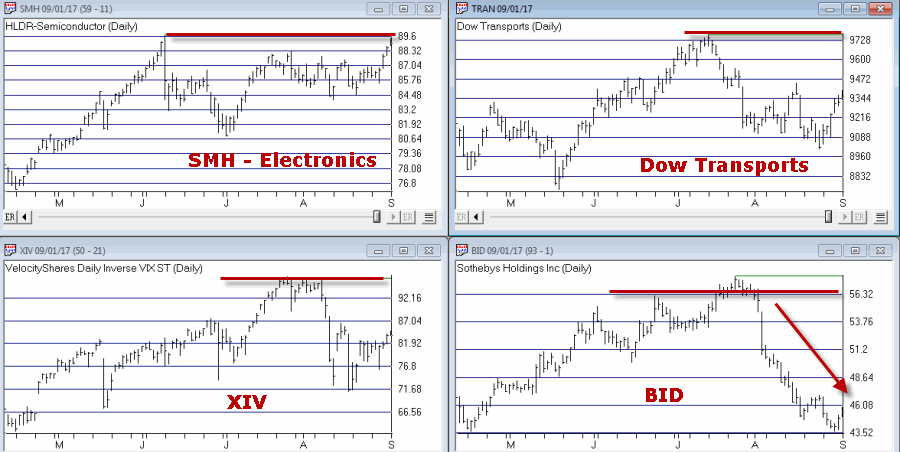
Fidelity Select Electronics
In Figure 1 you see, a) the blow-off top of 1999-2000 and b) today. Are the two the same? I guess only time will tell. But the point is, I can’t help but think that if and when the bloom comes off of the electronics boom, overall trouble will follow. Here is hoping that I am not as correct here as I was here.
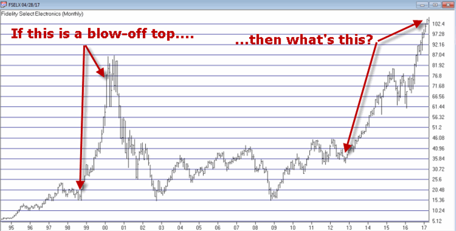
Figure 1 – Ticker FSELX (Courtesy AIQ TradingExpert)
Just asking.
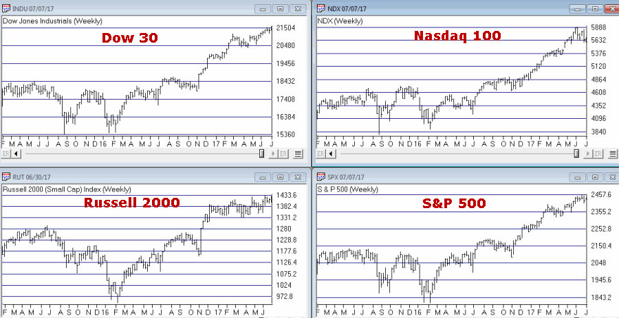
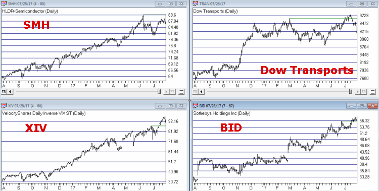
Transportation Index
As you can see in Figure 2, the Dow Transports has a history of making double tops which is followed by trouble in the broader market. Are we in the process of building another double top? And will trouble follow if we are? Dunno, hence the reason it is on my “Watch List” rather than on my “OH MY GOD SELL EVERYTHING NOW!!!!! List”.
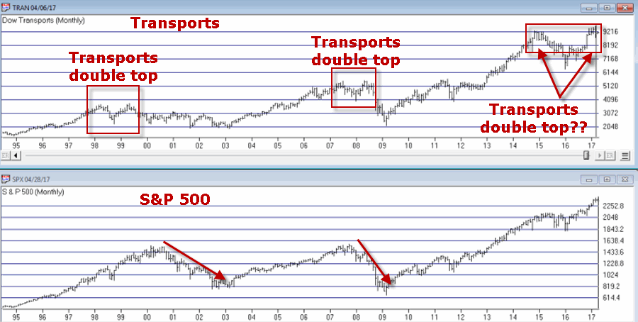
Figure 2 – Dow Transportation Index (Courtesy AIQ TradingExpert)
I guess we’ll just have to wait and see.
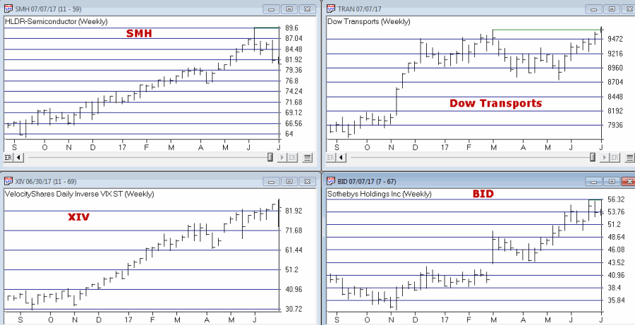
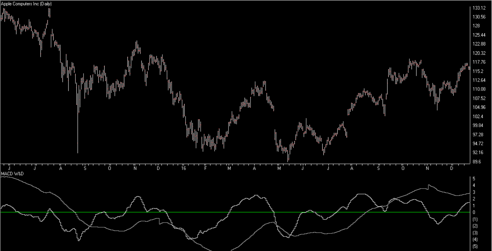
Ticker XIV
Ticker XIV is an ETF that is designed to track inverse the VIX Index. As a refresher, the VIX Index tends to “spike” higher when stocks fall sharply and to decline when stocks are rising and/or relatively quiet. To put it in simpler terms, in a bull market ticker XIV will rise. As you can see in Figure 3 one might argue that XIV has gone “parabolic”. This is a potential warning sign (assuming you agree that the move is parabolic) as a parabolic price move for just about anything is almost invariably followed by, well, let’s just say, “not so pretty”.
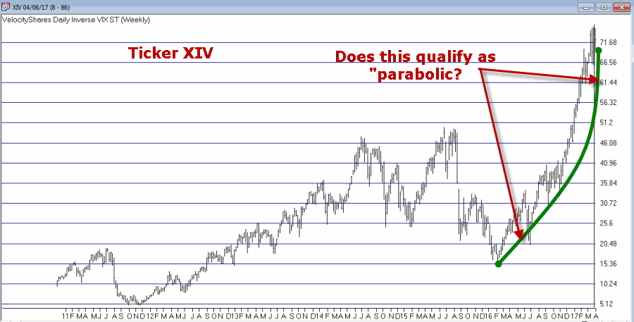
Figure 3 – Ticker XIV (Courtesy AIQ TradingExpert)
Let’s hope not. Because if it does qualify as parabolic that’s a very bad sign.
Ticker BID
This one may or may not be relevant but for what it is worth, Sotheby’s (ticker BID) has on several occasions served as something of a “leading indicator” at stock market tops (for the record it has also given some false signals, so this one is more for perspective purposes rather than actual trading purposes). Still, if this one tops out in conjunction with any or all of the above, it would likely serve as a useful warning sign.
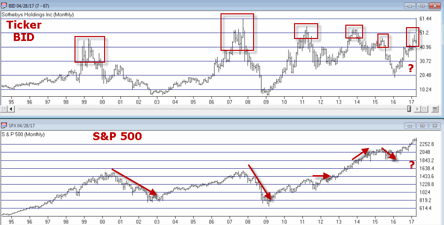
Figure 4 – Ticker BID (Courtesy AIQ TradingExpert)
Summary
There is no “urgent action” to be taken based on any of this. Bottom line: Nothing in this article should trigger you to run for the exits.
Still, it might be wise to at least take a look around and “locate the exit nearest you.”
You know, just in case.
Chief Market Analyst at JayOnTheMarkets.com and AIQ TradingExpert Pro (Courtesy AIQ TradingExpert) client. http://jayonthemarkets.com/
Disclaimer: The data presented herein were obtained from various third-party sources. While I believe the data to be reliable, no representation is made as to, and no responsibility, warranty or liability is accepted for the accuracy or completeness of such information. The information, opinions and ideas expressed herein are for informational and educational purposes only and do not constitute and should not be construed as investment advice, an advertisement or offering of investment advisory services, or an offer to sell or a solicitation to buy any security.
The post Four Things to Watch for Warning Signs appeared first on AIQ TradingExpert Pro.