Quantcast
Channel: AIQ TradingExpert Pro
Viewing all 213 articles
Browse latest View live

Trend or Countertrend? Why Not Both?

$
0
0
First the brutal disclaimers: What follows is NOT a trading “system.” It is merely an “idea.” Even more brutally, I can’t even claim that it “works”.  All the testing I have done so far is more anecdotal. Also to an extremely huge degree, the actual entry trigger and exit trigger that  trader might choose to use will have – as always – at least as much if not more impact on overall trading results as the actual “alert” signal detailed below.
Got that?  OK, then let’s proceed.
The Debate
The ongoing debate in trading is always – trend-following or countertrend?  Which is the way to go?  There are (conservatively) at least a bazillion and one ways to argue one way or the other.       Figure 1 displays ticker TXN with upper and lower “Acceleration Bands” (code for AIQ TradingExpert appears after disclaimer at end of article) drawn.
1
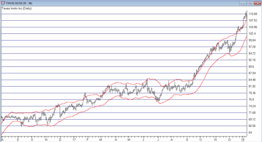
Figure 1 – Ticker TXN with Acceleration Bands (Courtesy AIQ TradingExpert)
Want to start a debate?  Ask this question: Is it better to buy when price hits the upper band or the lower band?  Sometimes price hits the upper band and just keeps going.  Sometimes it hits the upper band and the move peters out and reverses fairly quickly.
Going with the trend can lead to some big winning trades along the way, but typically involves a lot of whipsaws as well. Trading countertrend can lead to some great, quick profits – expect of course for when the initial trend never quite reverses and quick losses accrue instead.
What to do, what to do?
So the “idea” I mentioned at the outset generally goes like this:
*In an uptrend (which we will define in a moment)
*Wait for price to hit the Upper Band
*Then wait for a pullback
*Then wait for the uptrend to reassert itself
Got that? OK, me neither exactly.  So let’s try to define things a little more clearly.
1. As long as the closing price remains above the 200-day moving average, we will call that an “uptrend”
2. Within an uptrend wait for the high of a trading day to reach or exceed the Upper Acceleration Band.
3. Following #2, wait for the 4-day RSI to drop to 32 or lower with the following caveats:
*If price touches the Lower Acceleration Band OR closes below the 200-day moving average
*Then the setup is invalidated
This is the “Setup”.  For sake of example I will add an entry trigger as follows:
4. Following a valid #3 Alert Signal, buy when price exceeds the previous day’s high
I am going to purposely NOT add an exit trigger – just so that no one decides to “try it out” without at least giving it some thought on their own.
So Figure 2 shows the “Alerts” and “Entry Triggers” for the chart in Figure 1.
2
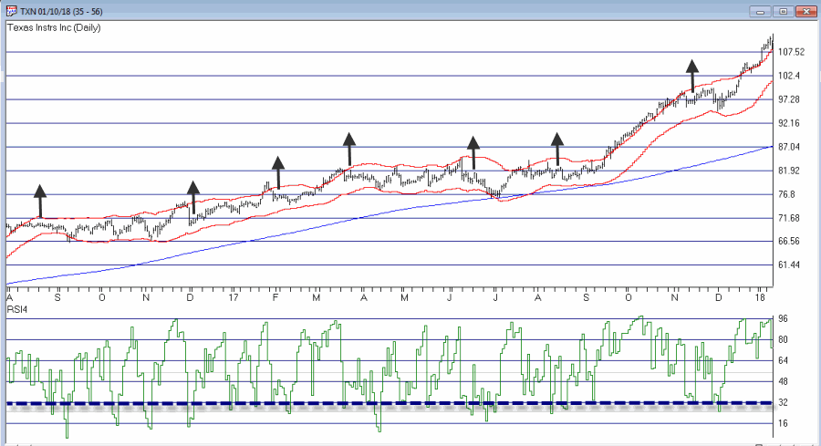
Figure 2 – Ticker TXN with Example “Entry Triggers” (Courtesy AIQ TradingExpert)
So Figure 3 shows the “Alerts” and “Entry Triggers” for ticker EBAY3
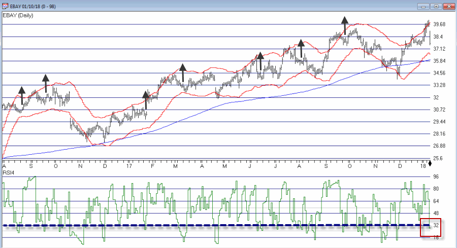
Figure 3 – Ticker EBAY with Example “Entry Triggers” (Courtesy AIQ TradingExpert)
So Figure 4 shows the “Alerts” and “Entry Triggers” for ticker CSCO
4
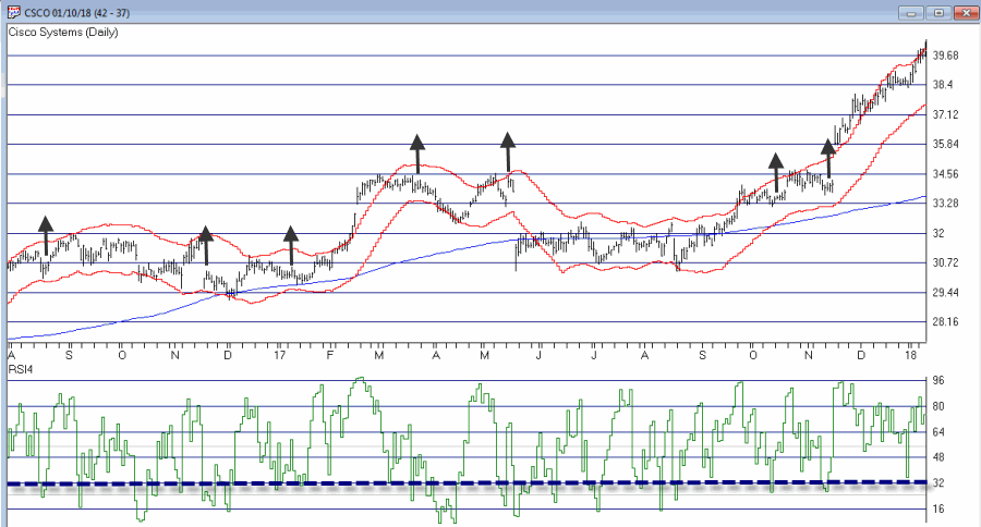
Figure 4 – Ticker CSCO with Example “Entry Triggers” (Courtesy AIQ TradingExpert)
So are these signals any good? Well, like a lot of trading methods, some look pretty good and others do not.  As I also mentioned earlier, a lot depends on the method or methods you use to exit each trade.
Summary
The reality is that there is a chance that the “idea” contained herein is just no darn good.
But also remember that there are other “trend filters” (besides the 200-day moving average), there are other “bands” (besides Acceleration Bands”), there are other oversold indicators (besides 4-day RSI) and there are other entry and exit triggers.
As such, this piece is essentially for people who are willing to do a little digging on their own and, a) become comfortable (or not) with the idea, and b) develop  some position sizing, stop-loss and profit-taking criteria.
Jay Kaeppel
Disclaimer:  The data presented herein were obtained from various third-party sources.  While I believe the data to be reliable, no representation is made as to, and no responsibility, warranty or liability is accepted for the accuracy or completeness of such information.  The information, opinions and ideas expressed herein are for informational and educational purposes only and do not constitute and should not be construed as investment advice, an advertisement or offering of investment advisory services, or an offer to sell or a solicitation to buy any security.
Acceleration Bands Code for AIQ Expert Design Studio EDS
a is ([high]-[low]).
b is ([high]+[low])/2.
c is (a / b).
d is (c*2).
e is (1+d).
f is (1-d).
g is ([high]*e).
h is ([low]*f).
AccelUB is Simpleavg(g, 20).
AccelLB is Simpleavg(h, 20).

The post Trend or Countertrend? Why Not Both? appeared first on AIQ TradingExpert Pro.


The VixRSI14 Indicator – Part 1

$
0
0

While the bulk of the financial world focuses most of its attention on whether or not Bitcoin will turn to sh, er, something that rhymes with Bitcoin, a lot of “old timers” continue on with trying to look at markets in a more traditional way. Unfortunately, some people who try to look at markets in a more traditional way also spend an inordinate amount of time “dividing one number by another” thinking there is some purpose to it (“Hi. My name is Jay”)

The only good news is that every once in awhile something useful – or at least potentially useful (since no single calculation guarantees profitability which also involves other “minor” issues such as which securities to trade, allocation size, entry method, profit taking criteria, stop loss triggers and so on and so forth). A number of years ago I stumbled upon a calculation that I ultimately refer to as VixRSI (for reasons that will become fairly obvious soon).  More specifically I have a few different versions but one I like is call used VixRSI14.

First the Good News: In this and some future articles I will detail how I apply VixRSI14 to monthly, weekly and daily price charts.

Now the Bad News: Nothing that I will write in any of those articles will detail a “simple automated system that generates you can’t lose trading signals guaranteed to make you rich beyond the dreams of avarice.”  Sorry about that. But I thought you should know.

The truth is that the indicator generates signals – and yes, a certain percentage of the time those signals aren’t that great.  And even on occasions when the signals are decent all of the factors I mentioned above (securities traded, capital allocation, etc.) still hold the key to turning a “signal” into a “profit”.

VixRSI14

VixRSI14 is calculated by combining Larry William’s “VixFix” indicator with the standard old 14-day RSI from Welles Wilder. I’ve decided to put the calculations at the end of the article in order to avoid scaring anyone off.

For now let’s look at what to look for on a monthly price chart.

VixRSI14 on a Monthly Chart

OK, true confession time: there is (at least as far as I can tell) no “one best way” to use VixRSI14 on a monthly chart.  So I will simply show you “One way.”

*A “buy alert” is triggered when the monthly value for VixRSI14 first rises to 3.5 or higher and then drops back to 3.0 or below

*Before going on please note that there is nothing “magic” about 3.5 or 3.  Different values can be used and will generate varying results.

*Also, some may prefer to simply look for a drop from above 3 to below 3 without requiring a move above 3.5

*Finally please note the use of the phrase “buy alert” and the lack of the phrase “BUY AS MUCH AS YOU CAN RIGHT THIS VERY MINUTE!!!!”

Figures 1 through 4 show several different Dow30 stocks “through the years.

1

Figure 1 – Ticker AXP (Courtesy AIQ TradingExpert)

2

Figure 2 – Ticker BA (Courtesy AIQ TradingExpert)

3

Figure 3 – Ticker HPQ (Courtesy AIQ TradingExpert)

4

Figure 4 – Ticker IBM (Courtesy AIQ TradingExpert)

Summary

Buy alerts on monthly charts using the criteria I described are obviously very rare.  In fact many securities never see the VixRSI14 rise high enough to trigger an alert.  Likewise, not every 3.5 then 3 event for every stock will work out as well as those depicted in Figures 1 through 4.

Still, remember that I am just presenting an “idea” and not a finished product.

Code:

William’s VixFix is simply the 22-day high price minus today’s low price divided by the 22-day high price (I then multiply by 100 and then add 50).  That may sound complicated but it is not.

The code for AIQ TradingExpert appears below.

########## VixFix Code #############

hivalclose is hival([close],22).

vixfix is (((hivalclose-[low])/hivalclose)*100)+50.

###############################

####### 14-period RSI Code ###########

Define periods14 27.

U14 is [close]-val([close],1).

D14 is val([close],1)-[close].

AvgU14 is ExpAvg(iff(U14>0,U14,0),periods14).

AvgD14 is ExpAvg(iff(D14>=0,D14,0),periods14).

RSI14 is 100-(100/(1+(AvgU14/AvgD14))).

###############################

VixRSI14 is then calculated by dividing the 3-period exponential average of VixFix by the 3-period exponential average of RSI14

####### VixRSI14 Code ###########

VixRSI14 is expavg(vixfix,3)/expavg(RSI14,3).

###############################

Jay Kaeppel

Disclaimer:  The data presented herein were obtained from various third-party sources.  While I believe the data to be reliable, no representation is made as to, and no responsibility, warranty or liability is accepted for the accuracy or completeness of such information.  The information, opinions and ideas expressed herein are for informational and educational purposes only and do not constitute and should not be construed as investment advice, an advertisement or offering of investment advisory services, or an offer to sell or a solicitation to buy any security.

The post The VixRSI14 Indicator – Part 1 appeared first on AIQ TradingExpert Pro.

The VixRSI14 Indicator – Part 2

$
0
0
In this article I detailed an indicator I refer to as VixRSI14 using monthly charts. Today let’s apply the same method to weekly bar charts.  Before we do that a quick look at how this indicator functions.
VixRSI combines two indicators – Larry William’s VixFix and Welles Wilder’s Relative Strength Index (RSI).  In Figure 1 you see a weekly bar chart for YHOO.  Notice that as price declines the VixFix indicator rises and RSI falls. VixRSI14 essentially measures the difference between the two and looks for extremes as a sign of a potential reversal. See Figure 5 for YHOO with VixRSI14.
0
Figure 1 – YHOO with Williams VixFix (with 3-day exponential smoothing) and Wilder’s 14-period RSI (Courtesy AIQ TradingExpert)
The Weekly Version of VixRSI14
We will use the same method I described in the previous article, i.e.:
*We will calculate the VixRSI14 indicator (see code at end of article) on a weekly basis
*A “buy alert” occurs when VixRSI14 drops below 3.00 after first rising to 3.50 or higher
Once again, please note that:
*There is nothing magic about 3.50 or 3.00
*Not every “buy alert” is followed by an immediate rally (or even any rally at all for that matter)
*Any actually trading”results” will depend heavily on what you trade, how much of it you trade, when you actually get in, when you get out with a profit and/or when you get out with a loss.
*This VixRSI14 alert signal is simply serving notice that a given security may be overdone on the downside and may be ready soon to reverse to the upside.  Nothing more, nothing less.1
Figure 2 – AAPL(Courtesy AIQ TradingExpert)
2
Figure 3 – AXP (Courtesy AIQ TradingExpert)
3
Figure 4 – IP (Courtesy AIQ TradingExpert)
4
Figure 5 – YHOO (Courtesy AIQ TradingExpert)
Summary
In 2018 I intend to try to share a few more trading “ideas” that maybe are not quite “finished products”.  VixRSI14 fits neatly into the “Idea” category. Sometimes the alerts are early.  Sometimes the alerts are late.  Sometime the alerts don’t really pan out at all.  Sometimes alerts are followed by one more sharp decline which is then followed by a major rally. So maybe some sort of trend reversal confirmation would be helpful.  I don’t know.
Hey, that gives me an idea….
Code:
William’s VixFix is simply the 22-period high price minus today’s low price divided by the 22-day period price (I then multiply by 100 and then add 50).  That may sound complicated but it is not.
The code for AIQ TradingExpert appears below.
########## VixFix Code #############
hivalclose is hival([close],22).
vixfix is (((hivalclose-[low])/hivalclose)*100)+50.
###############################
####### 14-period RSI Code ###########
Define periods14 27.
U14 is [close]-val([close],1).
D14 is val([close],1)-[close].
AvgU14 is ExpAvg(iff(U14>0,U14,0),periods14).
AvgD14 is ExpAvg(iff(D14>=0,D14,0),periods14).
RSI14 is 100-(100/(1+(AvgU14/AvgD14))).
###############################
VixRSI14 is then calculated by dividing the 3-period exponential average of VixFix by the 3-period exponential average of RSI14
####### VixRSI14 Code ###########
VixRSI14 is expavg(vixfix,3)/expavg(RSI14,3).
###############################
Jay Kaeppel
Disclaimer:  The data presented herein were obtained from various third-party sources.  While I believe the data to be reliable, no representation is made as to, and no responsibility, warranty or liability is accepted for the accuracy or completeness of such information.  The information, opinions and ideas expressed herein are for informational and educational purposes only and do not constitute and should not be construed as investment advice, an advertisement or offering of investment advisory services, or an offer to sell or a solicitation to buy any security.

The post The VixRSI14 Indicator – Part 2 appeared first on AIQ TradingExpert Pro.

What to Worry About – and When – in the Bond Market

$
0
0
There is a lot of hand-wringing going on these days regarding the bond market.  And rightly so given that interest rates have been (were?) in a downtrend for 35+ years.  Given that, given the long-term cyclical nature of interest rates and given that rates are at a generational low level, “concern” is understandable.
However, needless hand-wringing over events that have yet to occur is not.
rates long-term
Figure 1 – Long-term treasury yields through the years (Courtesy: ObservationsanNotes.blogspot.com)
(The chart in Figure 1 is updated only through about 2012.  Nevertheless, it effectively highlight the long-term cyclical nature of interest rates.)
The problem is the “well, interest rates are destined to rise therefore I should immediately [fill in your defensive action here].”
Many analysts and investors are following and attempting to interpret every tick in bond yields.  In fact, some very well known bond “people” have proclaimed a “bond bear market”.  And they may be right.  But still…
What I Follow in the Bond Market
What follows are a few random thoughts on some of the things I look at when tracking the bond market.
#1. 30-Year Yield versus 120-month Exponential Moving Average
Figure 2 displays ticker TYX, an index which tracks the yields on 30-year bonds (for some reason it multiplies by 10 – so a yield of 3% appears on the chart as 30.00).
2
Figure 2 – 30-year treasury yields versus 120-month exponential moving average (Courtesy AIQ TradingExpert)
Using the data from Figure 1 I have found that a 120-month (i.e., 10-year) average does a pretty good job of riding the major trends in interest rates.  As you can clearly see in Figure 2, TYX is still noticeably below its 120-month EMA.  This could obviously change quickly but  for the moment by this objective measure the long-term trend in interest rates right at this very moment is still “down.”
Please note that I am not saying that interest rates will not rise and move above this MA.  I am saying two things:
1. Until the crossover occurs try not to focus too much attention on dire predictions.
2. Once the crossover does occur the bond market environment that most of us have known throughout all or most of our investment lives will change dramatically (more on this topic when the time is right).
#2.  The Yield Curve(s)
Figure 3 displays the yield curves for 30-year yields minus 10-year yields and 10-year yields minus 2-year yields. The narrowing trend is obvious. This is causing great consternation because historically when the yield curve “inverts” (i.e., when shorter-term rates are higher than longer-term rates) it is a very bad sign for the economy and the financial markets.
3
Figure 3 – 10-yr yield minus 2-year yield (blue) and 30-year yield minus 10-year yield (orange); (Courtesy: YCharts)
The problem here is that there is still an important difference between “narrowing” and actual “inverting”.  Many people seems to look at Figure 3 and assume that an inverted yield curve (i.e., if and when these lines go into negative territory) is “inevitable” and that things are therefore doomed to get worse for the economy and the markets.
Repeating now: There is still an important difference between a “narrowing” yield curve and an actual “inverted” yield curve.  Until the yield curve actually does invert try not to focus too much attention on dire predictions.
#3. The Current Trend in Bonds
One trend following indicator that I follow (and have written about in the past) is the inverse relationship between long-term t-bonds and Japanese stocks.  Figure 4 display ticker EWJ (an ETF that tracks an index of Japanese stocks) versus ticker TLT (an ETF that tracks the long-term treasury bond).
4
Figure 4 – Ticker EWJ versus Ticker TLT (Courtesy AIQ TradingExpert)
Figure 5 displays two equity curves.  The blue line represents the $ gain achieved by holding long 1 treasury bond futures contract ONLY when the EWJ 5-week moving average is below the EWJ 30-wek moving average and the red line represents the $ loss achieved by holding long 1 treasury bond futures contract ONLY when the EWJ 5-week moving average is above the EWJ 30-week moving average.
5
Figure 5 – Holding long t-bond futures when EWJ is in a downtrend (blue line) versus holding long t-bond futures when EWJ is in an uptrend (red line); December 2003-present
Notice anything different about  the blue line versus the red line?  With EWJ trending strongly higher, caution remains in order or the long-term treasury bond. If the trend in EWJ reverses things may look better for long-term bonds.
#4. Short and Intermediate Term Bonds remain a Viable Alternative
As I wrote about here an index of short and intermediate treasury and high grade corporate remains a viable long-term approach for income investors. Figure 6 displays the growth of $1,000 invested using the “Boring Bond Index” I wrote about in the aforementioned article.  This index has gained in 38 of the past 42 years.6
Figure 6 – Growth of $1,000 invested using “Boring Bond Index” Method; 12/31/1975-11/30/2017
Summary
There are good reasons to be wary of interest rates and bonds. At the same time overreacting to dire headlines also remains a very poor approach to investing.
So in sum:
*The very long-term trend in interest rate is still technically “down”
*The yield curve is narrowing but still has a ways to go before it inverts
*The current trend in long-term bonds is bearish
*Short and intermediate term bonds experience much less volatility than long-term bonds (and reinvest more frequently, which may come in handy if rates do begin to  rise in earnest).
*If and when TYX pierces its long-term average and/or when the yield curve inverts, the time will arrive for investors to make some wholesale changes in how they approach their bond market investments.
*If and when EWJ starts to fall, things may improve for the current plight of the long-term treasury.
*And through it all, a boring approach to bonds may still prove very useful.
Jay Kaeppel
Disclaimer:  The data presented herein were obtained from various third-party sources.  While I believe the data to be reliable, no representation is made as to, and no responsibility, warranty or liability is accepted for the accuracy or completeness of such information.  The information, opinions and ideas expressed herein are for informational and educational purposes only and do not constitute and should not be construed as investment advice, an advertisement or offering of investment advisory services, or an offer to sell or a solicitation to buy any security.

The post What to Worry About – and When – in the Bond Market appeared first on AIQ TradingExpert Pro.

Is a Reprieve for Bonds in the Offing?

$
0
0
The question on many investors’ minds is “are we in a bond bear market?”  Given that long-term treasuries have lost roughly 17% since July of 2016 it is a fair question.
The main model that I use is still bearish on bonds (more on this topic below).  Still, there are a few potential “lights at the end of the bond tunnel” – at least potentially in the near-term.
Long-Term Rates
My mega long-term “fail-safe” bond trend indicator appears in Figure 1.  It is the yield on 30 year treasuries (ticker TYX – which is multiplied by 10 for some unknown reason) with a 120-month exponential moving average.
0Figure 1 – 30-Yr. Treasury yields (Ticker TYX) with 120-month average (Courtesy AIQ TradingExpert)
When the day comes that TYX breaks out above the 120-month moving average I for one will officially designate the great bond bull market as “over.”  And that day is coming.  But for what it’s worth – it’s not quite here yet.
Metals Positive for Bonds
In this article I wrote about a bond timing model that uses the relationship between gold and copper.  Like a lot of timing models of all stripes it does a good job of differentiating good times for bonds from bad times for bonds, but is very far from perfect.
It goes like this:
A = Gold / Copper
B = 30-day moving average of A
C = 80-day moving average of A
D = B – C
If D > 0 = Bullish for bonds*
If D < 0 = Bearish for bonds*
*- with a 1-day lag
This indicator flipped to bullish at the close on 2/7/18 after being bearish since 7/10/2017.
Figure 2 displays the action of ticker TLT since the last “sell” signal in July 2017.  As you can see, in the end it ended up being “correct” as TLT was lower on 2/7/18 than it was on 7/10/17.  But that was not the case until the last week or so.  So for most of the time during this bearish period TLT traded higher.
1Figure 2 – Ticker TLT with recent Jay’s Metal Model signals (Courtesy AIQ TradingExpert)
What is most important however is to focus on the long-term results. In Figure 2 the blue line depicts the growth of equity achieved by holding long 1 t-bond futures contract ONLY when the model is bullish while the red line depicts the growth of equity achieved by holding long 1 t-bonds futures contract ONLY when the model is bearish (red line).
2aFigure 2 – T-bond futures $ gain/loss when Jay’s Metal Model is bullish (blue line) versus when model is bearish (red line)
The long-term difference in performance is fairly obvious.  That being said it should also be noted that the blue line is by no means a series of straight line advances, i.e., there is no guarantee that this latest bullish signal will prove fortuitous, especially given that we may be transitioning from a long-term bond bull market to a long-term bond near market.
One More Possible Piece of Good News
In this article I applied an indicator I originally learned from Tom McClellan at http://www.mcoscillator.com to weekly TLT.  This indicator looks at the number of times TLT has been up minus the number of times down over the past 20 weeks. Very often a drop to -2 or below followed by an upside reversal of 2 points (i.e., it drops to -2 then subsequently rises to 0, or drops to -3 then rises to -1 and so on) has presaged a favorable up move in bonds. This indicator applied to TLT recently fell to -2 and may flash a favorable signal soon (please note that it HAS NOT given a buy signal yet and that it  could take several weeks before it does).
3Figure 3 – Weekly TLT with UpDays20 Indicator (Courtesy AIQ TradingExpert)
One Piece of “Still Bad News”
In this article I wrote about one of the main bond models I use that uses the trend in Japanese stocks to trade bonds inversely, i.e., if Japanese stocks are bearish it is bullish for bonds and vice versa. I use a 5-week and 30-week moving average to quantify Japanese stocks as “bullish” or “bearish”.
In Figure 4 when the blue line in the top clip is above the red line this is considered bearish for bonds and when the blue line is below the red line it is considered bullish for bonds. For now the blue 5-week average line is still well above the red 30-week average, so this indicator still  designates the trend for bonds as “bearish”.
4aFigure 4 – Ticker TLT tends to trade inversely to ticker EWJ (Courtesy AIQ TradingExpert)
Summary
So are bonds due to rally?  Well, it seems like at least a short-term bounce could be in the offing.  That being said, with bonds breaking down sharply at the moment, 1) this “idea” is geared for “traders” who are not afraid of (and are unacquainted with) taking risks, 2) it might make sense to wait for the UpDays20 indicator discussed above to tick higher by two points – which could take up to several weeks to play out – before “taking the plunge.”
As always I am not “recommending” anything, just highlighting what I see.  For longer-term investors the “Boring Bond Index” bond strategy I wrote about here remains a viable  long-term approach to bond investing.
Jay Kaeppel
Disclaimer:  The data presented herein were obtained from various third-party sources.  While I believe the data to be reliable, no representation is made as to, and no responsibility, warranty or liability is accepted for the accuracy or completeness of such information.  The information, opinions and ideas expressed herein are for informational and educational purposes only and do not constitute and should not be construed as investment advice, an advertisement or offering of investment advisory services, or an offer to sell or a solicitation to buy any security.

The post Is a Reprieve for Bonds in the Offing? appeared first on AIQ TradingExpert Pro.

World Met Resistance

$
0
0

In this article titled “World, Meet Resistance” – dated 12/21/2017 – I noted the fact that many single country ETFs and regional indexes were closing in on a serious level of potential resistance.  I also laid out three potential scenarios.  So what happened?  A fourth scenario not among the three I wrote about (Which really pisses me off.  But never mind about that right now).

As we will see in a moment what happened was:

*(Pretty much) Everything broke out above significant resistance

*Everything then reversed back below significant resistance.

World Markets in Motion

Figure 1 displays the index I follow which includes 33 single-country ETFs. As you can see, in January it broke out sharply above multi-year resistance. Just when it looked like the index was going to challenge the all-time high the markets reversed and then plunged back below the recently pierced resistance level.

(click to enlarge)1

Figure 1 – Jay’s World Index broke out in January, fell back  below resistance in February (Courtesy AIQ TradingExpert)

The same scenario holds true for the four regional indexes I follow – The Americas, Europe, Asia/Pacific and the Middle East – as seen in Figure 2.

(click to enlarge)2

Figure 2 – Jay’s Regional Index all broke above resistance, then failed (Courtesy  AIQ TradingExpert)

So where to from here?  Well I could lay out a list of potential scenarios. Of course if history is a guide what will follow will be a scenario I did not include (Which really pisses me off.  But never mind about that right now).

So I will simply make a subjective observation based on many years of observation.  The world markets may turn the tide again and propel themselves back to the upside.  But historically, when a stock, commodity or index tries to pierce a significant resistance level and then fails to follow through, it typically takes some time to rebuild a base before another retest of that resistance level unfolds.

Here’s hoping I’m wrong

Jay Kaeppel

Disclaimer:  The data presented herein were obtained from various third-party sources.  While I believe the data to be reliable, no representation is made as to, and no responsibility, warranty or liability is accepted for the accuracy or completeness of such information.  The information, opinions and ideas expressed herein are for informational and educational purposes only and do not constitute and should not be construed as investment advice, an advertisement or offering of investment advisory services, or an offer to sell or a solicitation to buy any security.

The post World Met Resistance appeared first on AIQ TradingExpert Pro.

Trend Following in One Minute a Month

$
0
0

In the article linked below, investor and Forbes columnist Kenneth Fisher writes about what to look for at a market top (How to Tell a Bull Market from a Bear Market Blip). One piece of advice that I have heard him offer before is to wait at least 3 months after a top in price to worry about whether or not we are in a bear market.  That is good advice and provided the impetus for a simple trend-following model I follow based on that “wait 3 months” idea.

First, a few key points:

*Trend-following is NOT about picking tops and bottoms or timing the market with “uncanny accuracy”.  So don’t expect any trend-following system to do so.

*The primary edge in any trend-following method is simply missing as much of the major soul – and capital – crushing bear markets as possible, with the understanding that you will miss some of the upside during bull markets.

The Good News:

*Starting in November 1970 this system has beaten a buy and hold strategy

*This system requires no math. There are no moving averages, etc.  Anyone can look at a monthly S&amp;P 500 bar chart and generate the signals.  And it literally takes less than 1 minute per month to update.

The Bad News:

*Every trend-following method known to man experiences whipsaws, i.e., a sell signal followed by a buy signal at a higher price.  This system is no exception.

*Due to said whipsaws this system has significantly underperformed the S&amp;P 500 buy-and-hold since the low in early 2009.

For what it’s worth, my educated guess is that following the next prolonged bear market, that will change.  But there are no guarantees.

OK, all the caveats in place, here goes.

Jay’s Monthly SPX Bar Chart Trend-Following System

*This system uses a monthly price bar chart for the S&amp;P 500 (SPX) to generate trading signals.

*For the purposes of this method, no action is taken until the end of the month, even if a trend change is signaled earlier in the month.

*A buy signal occurs when during the current month, SPX exceeds its highest price for the previous 6 calendar months.

A sell signal occurs as follows:

a) SPX registers a month where the high for the month if above the high of the previous month. We will call this the “swing high”.

b) SPX then goes 3 consecutive monthly bars without exceeding the “swing high.” When this happens, note the lowest low price registered during those 3 months. We will call this price the “sell trigger price.”

c) An actual sell trigger occurs at the end of a month when SPX register a low that is below the “sell trigger price”, HOWEVER,

d) If SPX makes a new monthly high above the previous “swing high” BEFORE it registers a low below the “sell trigger price” the sell signal alert is aborted

Sounds complicated right?  It’s not.  Let’s illustrate on some charts.

In the charts that follow:

*An Up green arrow marks a buy signal

*A Down red arrow marks a sell signal

*A horizontal red line marks a “sell trigger price”.

Sometimes a sell trigger price is hit and is marked by a down red arrow as a sell signal.  Other times a sell trigger price is aborted by SPX making a new high and negating the potential sell signal.

spx trendf 1

Figure 1 – SPX signals 1970-1979 (Courtesy AIQ TradingExpert)

SPX trendf 2

Figure 2 – SPX signals 1980-1989 (Courtesy AIQ TradingExpert)

SPX trendf 3

Figure 3 – SPX signals 1990-1999 (Courtesy AIQ TradingExpert)

SPX trendf 4

Figure 4 – SPX signals 2000-2009 (Courtesy AIQ TradingExpert)

SPX trendf 5

Figure 5 – SPX signals 2010-present (Courtesy AIQ TradingExpert)

To demonstrate results we will use monthly close price data for SPX.  If the system is bullish then the system will hold SPX for that month.  If the system is bearish we will assume interest is earned at an annual rate of 1% per year.

Figure 6 displays the results of the System versus Buy and Hold starting with $1,000 starting November 1970 through 1994 (roughly 24 years).

6

Figure 6 – Growth of $1,000 invested using System versus Buy-and-Hold; Nov-1970 through Dec-1994

Figure 7 displays the results of the System versus Buy and Hold starting with $1,000 starting at the end of 1994 through the most recent close.

7

Figure 7 – Growth of $1,000 invested using System versus Buy-and-Hold; Dec-1994 through Feb-2018

Figure 8 displays the growth of $1,000 generated by holding the S&amp;P 500 Index ONLY when the trend-following system is bearish.  In Figure 8 you will see exactly what I mentioned at the outset – that the key is simply to miss some of the more severe effects of bear markets along the way.

8

Figure 8 – Growth of $1,000 invested ONLY when trend-following model is Bearish; 1970-2018

Finally, Figure 9 displays trade-by-trade results (using month-end price data).

9

Figure 9 – Trade-by-trade results; Month end price data

Summary

So is this “The World Beater, Best Thing Since Sliced Bread” system?  Not at all.  If you had started using this system in real time in March of 2009 chances are by now you would have abandoned it and moved on to something else, as the whip saw signals in 2011-2012 and 2016 has the System performing worse than buy and hold over a 9 year period.

But here is the thing to remember.  Chances are prolonged bear markets have not been eradicated, never to occur again.  100+ years of market history demonstrates that bear markets of 12 to 36 months in duration are simply “part of the game”.  And it is riding these bear markets to the depths that try investors souls – and wipe out a lot of their net worth in the process.

Chances are when the next 12 to 36 month bear market rolls around – and it will – a trend-following method similar to the one detailed here may help you to “save your sorry assets” (so to speak).

Jay Kaeppel

Disclaimer:  The data presented herein were obtained from various third-party sources.  While I believe the data to be reliable, no representation is made as to, and no responsibility, warranty or liability is accepted for the accuracy or completeness of such information.  The information, opinions and ideas expressed herein are for informational and educational purposes only and do not constitute and should not be construed as investment advice, an advertisement or offering of investment advisory services, or an offer to sell or a solicitation to buy any security.

The post Trend Following in One Minute a Month appeared first on AIQ TradingExpert Pro.

Biotech + Gold (Updated)

$
0
0
In this article I wrote about an index I follow that combines the biotech sector with the gold stock sector. I also wrote about “one way” to trade that index.  This article builds on that piece and adds a new “rule” to create more trading opportunities.
The BIOGOLD Index
Figure 1 displays the index that I created using AIQ TradingExpert.  It combines ticker FBIOX (Fidelity Select Biotech) with ticker FSAGX (Fidelity Select Gold).
1
Figure 1 – Jay’s BIOGOLD Index (Courtesy AIQ TradingExpert)
Also included in the lower clip is an indicator referred to as RSI32, which is the 2-day average of the standard 3-day RSI.
The Old System
In the original article I tested an approach that works as follows using monthly data:
*When the RSI32 drops to 32 or below, buy BOTH FBIOX and FSAGX
*After a buy signal, sell both funds when RSI32 rises to 64 or higher
For results, please see the original article.
The New System
The “new rules” are as follows:
A “buy signal” occurs when either:
*The RSI32 drops to 32 or below
*The RSI32 drops below 50 (but not as low as 32) and then reverses to the upside for one month
After either of the buy signals above occurs, buy BOTH FBIOX and FSAGX
*After a buy signal, sell both funds when RSI32 rises to 64 or higher
Figure 2 displays the BIOGOLD Index with various buy and sell signals marked.
2
Figure 2 – Jay’s BIOGOLD Index with RSI32 signals (Courtesy AIQ TradingExpert)
To test results we will:
*Assume that after a buy signal both FBIOX and FSAGX are bought in equal amounts
*We will assume that both funds are held until RSI32 reaches 64 or higher (i.e., there is no stop-loss provision in this test)
For testing purposes we will not assume any interest earned while out of the market, in order to highlight only the performance during active buy signals. Figure 3 displays the hypothetical growth of $1,000 (using monthly total return data) using the “system”.
3
Figure 3 – Hypothetical Growth of $1,000 using Jay’s BIOGOLD System (1986-present)
Summary
For the record, I am not “recommending” that anyone go out and initiate trading biotech and gold based on what I have written here.  Before trading using any approach it is essential for a trader to do their own homework and carefully consider all of the pro’s and con’s associated with any specific approach.  For example, while the trade-by-trade results for the above look reasonably good, it should be noted that there have been 4 separate drawdown’s in excess of -19% along the way, including a maximum drawdown of -37% in 2008.  In considering any approach to trading it is essential to first think long and hard about how well one would “weather the storms”, BEFORE focusing on potential profitability.
To put it more succinctly is the simple phrase “Don’t cross the river if you can’t swim the tide.”
Jay Kaeppel
Disclaimer:  The data presented herein were obtained from various third-party sources.  While I believe the data to be reliable, no representation is made as to, and no responsibility, warranty or liability is accepted for the accuracy or completeness of such information.  The information, opinions and ideas expressed herein are for informational and educational purposes only and do not constitute and should not be construed as investment advice, an advertisement or offering of investment advisory services, or an offer to sell or a solicitation to buy any security.

The post Biotech + Gold (Updated) appeared first on AIQ TradingExpert Pro.


Prepare to Bounce

$
0
0

2018 sure was a great year for the stock market.  For almost a month anyway.  Since then, not so much.  And on the heels of last week’s selloff a lot of pundits and prognosticators are suggesting more loudly that the Great Bull Run is dead. And maybe they are right.  But maybe not.

It is almost always a mistake to hang your hat on one indicator to guide your actions going forward.  But at the same time, sometimes one indicator generates a signal so clear it perhaps should grab your attention.  Let’s look at one that is on the verge of sending an important signal.

The VixRSIRatio Indicator

This is an indicator that I developed a number of years ago by basically – I am going to use some highly technical terms here to describe the process I followed so please try to stay with me – mashing together several other indicators from other people.  If you are interested in the actual calculations they appear at the end of the article.  For now, just know that I refer to it as VixRSIRatio.  As I follow it, it gives meaningful signals very infrequently.  But that is OK as the signals it does give often prove to be useful.

For our purposes we will apply it to ticker SPY – an ETF that tracks the S&amp;P 500 Index. The rule is simple:

*A “Bullish Alert” occurs when VixRSIRatio drops to -210 or below and then turns up.

That’s it. Now please note the use of the phrase “Bullish Alert” and the lack of the words “You”, “Can’t” and “Lose”, as well as the lack of the phrase “by putting all of your money in the market at the exact moment a signal occurs.”

This is key.  Also note that there is nothing “magic” about the value -210. Nothing scientific about it. It just seems like a useful cutoff.  Now let’s look at the “Bullish Alert” signals in recent years.  They appear in Figures 1 through 4.

1

Figure 1 – Jay’s VixRSIRatio; 2014-2018 (Courtesy AIQ TradingExpert)

2

Figure 2 – Jay’s VixRSIRatio; 2010-2013(Courtesy AIQ TradingExpert)

3

Figure 3 – Jay’s VixRSIRatio; 2006-2009 (Courtesy AIQ TradingExpert)

4

Figure 4 – Jay’s VixRSIRatio; 2001-2005 (Courtesy AIQ TradingExpert)

As you can see in Figures 1 through 4:

a) Readings below -210 tend to be followed by – at the least – decent trading opportunities.

b) Often these readings presage significant market advances

c) And alas, sometimes the signals come too soon and/or are not followed by much of an advance.

The Here and Now

As of 3/23/18 the VixRSIRatio for ticker SPY stood -354.  So clearly “Buy Alert” is at hand.  So the obvious question is “What comes next”?  Will it be a, b, or c above?

As always, time will tell.

Calculations

In a nutshell, VixRSIRatio combines Larry Williams’ Vixfix indicator with Welles Wilder’s 3-day and 14-day RSI indicators to create two more indicators – VixRSI3 and VixRSI14.  We then divide VixRSI3 by VixRSI14 and invert the whole thing (so that we get an indicator that gives negative readings when the market goes down).

Now you see why I put this at the end….

Below is the code for AIQ Expert Design Studio

############## Larry Williams Vixfix #################

xx is 15.

hivalclose is hival([close],22).

vixfix is (((hivalclose-[low])/hivalclose)*100)+50.

############ Welles Wilder RSI 3-day ##############

Define days3 5.

U3 is [close]-val([close],1).

D3 is val([close],1)-[close].

AvgU3 is ExpAvg(iff(U3&gt;0,U3,0),days3).

AvgD3 is ExpAvg(iff(D3&gt;=0,D3,0),days3).

RSI3 is 100-(100/(1+(AvgU3/AvgD3))).

############ Welles Wilder RSI 14-day ##############

Define days14 27.

U14 is [close]-val([close],1).

D14 is val([close],1)-[close].

AvgU14 is ExpAvg(iff(U14&gt;0,U14,0),days14).

AvgD14 is ExpAvg(iff(D14&gt;=0,D14,0),days14).

RSI14 is 100-(100/(1+(AvgU14/AvgD14))).

############Jay’s VixRSIRatio ##############

VixRSI3 is expavg(vixfix,3)/expavg(RSI3,3).

VixRSI14 is expavg(vixfix,3)/expavg(RSI14,3).

VixRSIRatio is -((((VixRSI3/VixRSI14)-1)*100)-50).

Jay Kaeppel

Disclaimer:  The data presented herein were obtained from various third-party sources.  While I believe the data to be reliable, no representation is made as to, and no responsibility, warranty or liability is accepted for the accuracy or completeness of such information.  The information, opinions and ideas expressed herein are for informational and educational purposes only and do not constitute and should not be construed as investment advice, an advertisement or offering of investment advisory services, or an offer to sell or a solicitation to buy any security.

The post Prepare to Bounce appeared first on AIQ TradingExpert Pro.

The Pause That $@%! Refreshes?

$
0
0

A glance at the history of the Presidential Election Cycle in the stock market suggests that we should:

*Not be surprised that the stock market is foundering a bit at the moment

*Not be terribly surprised if things get worse – particularly during the months of June through September of this year

*Anticipate that if the market does take a bigger hit in the months ahead that it may well set the stage for another significant advance into the middle of the mid-term election year.

A Little Presidential Election Cycle History

For our purposes we will start the test on 12/31/1932 and define the cycle as containing the following four years:

*Post-Election

*Mid-Term

*Pre-Election

*Election

First the Bad News: Figure 1 displays the growth of $1,000 invested in the S&amp;P 500 Index (using monthly closing price data) ONLY from the end of January of each Mid-Term Election Year through the end of September of each Mid-Term Election Year (i.e., the latest iteration began on 1/31/2018 and will extend through 9/30/2018).

1

Figure 1 – Growth of $1,000 invested in S&P 500 Index ONLY from Jan31 through Sep30 of each Mid-Term Election Year (1932-2018)

As you can see, the cumulative performance for the S&P 500 Index during the Mid-Term February through September period is a fairly painful -44.3% (for the record, the cumulative gain from buying and holding the S&P 500 from 12/31/1932 through 2/28/2018 was +39,288%, so yes, this qualifies as a period of some serious under performance).

That being said, it should be noted that this Mid-Term Feb through Sep period showed a gain 12 times and a loss only 9 times.  So a “rough patch” is no sure thing. The problem is that when this period is bad, it is “very bad”.  As you can see in Figure 3 later, this period experienced 6 losses in excess of -17.5% (FYI, a -17.5% decline from the 1/31/2018 close of 2823.81 would see the S&P 500 Index hit 2330).

Then the Good News: On the brighter side, Figure 2 displays the growth of $1,000 invested in the S&amp;P 500 Index (using monthly closing price data) ONLY from the end of September of each Mid-Term Election Year through the end of July of each Pre-Election Year (i.e., the latest iteration begins on 9/30/2018 and will extend through 7/31/2019).

2

Figure 2 – Growth of $1,000 invested in S&P 500 Index ONLY from Sep30 of each Mid-Term Election Year through Jul31 of each Pre-Election Year (1932-2018)

Notice any difference between Figures 1 and 2?  This favorable period saw the S&P 500 register a gain during 20 of the past 21 completed election cycles (i.e., 95% of the time), with an average gain of +21.6%, and a cumulative gain of +3,730%.

Figure 3 displays the numerical results for each cycle.

Mid-Term Pre-Election Mid-Term Feb through Sep Mid-Term Oct thru Pre-Election July
1934 1935 (18.5) 21.8
1938 1939 14.5 (1.6)
1942 1943 0.5 32.0
1946 1947 (19.4) 5.3
1950 1951 14.1 15.2
1954 1955 23.9 34.7
1958 1959 20.0 20.9
1962 1963 (18.3) 22.9
1966 1967 (17.6) 23.8
1970 1971 (0.8) 13.4
1974 1975 (34.2) 39.7
1978 1979 14.9 1.2
1982 1983 0.0 35.0
1986 1987 9.2 37.8
1990 1991 (7.0) 26.7
1994 1995 (3.9) 21.5
1998 1999 3.7 30.6
2002 2003 (27.9) 21.5
2006 2007 4.4 8.9
2010 2011 6.3 13.2
2014 2015 10.6 6.7

Figure 3 – Unfavorable versus Favorable portions of Election Cycle

Summary

So what does it all mean?  Well, it means a few things. By my objective measurements the overall trend is still “bullish” and a number of “oversold” indicators are suggesting that a bounce of some significance may be at hand.  That being said, if the major market indexes do start to break down below their respective 200-day moving averages investors may be wise to take some defensive action.  If the market does experience a further break between now and the end of September, it may well be “one of the painful kind.”  So if you haven’t already, make your contingency plans now.

4

Figure 4 – Major Market Indexes with 200-day moving averages (Courtesy AIQ TradingExpert)

At the same time, as the end of September of 2018 nears – especially if the stock market has experienced or is experiencing at the time, a significant break – remember that history suggests that that will be a good time to “think bullish.”

Call me a cynic, but my guess is that alot of investors will do exactly the opposite on both counts (i.e., hang on if the market breaks down and then sell as the next bottom forms – Same it as ever was….)

Jay Kaeppel

Disclaimer:  The data presented herein were obtained from various third-party sources.  While I believe the data to be reliable, no representation is made as to, and no responsibility, warranty or liability is accepted for the accuracy or completeness of such information.  The information, opinions and ideas expressed herein are for informational and educational purposes only and do not constitute and should not be construed as investment advice, an advertisement or offering of investment advisory services, or an offer to sell or a solicitation to buy any security.

The post The Pause That $@%! Refreshes? appeared first on AIQ TradingExpert Pro.

“Yes”, We are at a Critical Juncture

$
0
0

There are times when the market just moves along from day-to-day and us “junkies” might hang on every move but to the average investor what happens today or tomorrow is really not all that meaningful in the whole big spectrum of things.

And then there are times like now.  As you can see in Figure 1, the major market indexes are struggling and are testing their respective 200-day moving averages.  How this “dance” plays out may have important implications for virtually all stock market investors.

(click to enlarge)

1

Figure 1 – Major indexes “on the edge” (Courtesy AIQ TradingExpert)

First off let me say this: There is nothing “magic” about a 200-day moving average.  It was interesting that the other day when the S&amp;P 500 Index closed below its 200-day average (it was the only major index to do so) roughly 22,367 articles appeared on the internet sounding the alarm.  Now I do pay a lot of attention to moving averages, but more to get a sense of trend than as automatic buy and sell triggers.  Which leads me to invoke:

Jay’s Trading Maxim #81: Contrary to popular belief, a price drop below a “key” moving average does NOT imply the onset of immediate and total Armageddon.

And

Jay’s Trading Maxim #81a: Um, but it could. So best to pay attention.

3 Possibilities

Actually there are a few others but the most likely outcomes – and the implications – are:

1. A reversal back to the upside – If the major averages hold here above their recent lows.  If this happens a strong rally to the upside is a strong possibility. Which is one reason it is too soon to “jump ship.”

2. A breakdown by all major indexes – If a majority of the major indexes break down below their recent lows investors are urged to take defensive measure.  Whether that involves selling shares/funds/ETFs/etc or hedging with options and/or inverse products is up to each investor.

3. A whipsaw – One other dreaded possibility involves both of the above – i.e., the average break down far enough briefly to trigger a defensive action only to quickly reverse back to the upside. This often leaves a lot of investors standing there dumbstruck and unable to pull the trigger to get back in.

Like I said, this is a critical juncture.  Whatever happens, investors need to pay attention and stand ready to, a) do nothing, or, b) take defensive action, or, c) take defensive action and then undo the defensive action and get bullish again (in the event of a whipsaw).

Steady, people, steady….

Jay Kaeppel

Disclaimer:  The data presented herein were obtained from various third-party sources.  While I believe the data to be reliable, no representation is made as to, and no responsibility, warranty or liability is accepted for the accuracy or completeness of such information.  The information, opinions and ideas expressed herein are for informational and educational purposes only and do not constitute and should not be construed as investment advice, an advertisement or offering of investment advisory services, or an offer to sell or a solicitation to buy any security.

The post “Yes”, We are at a Critical Juncture appeared first on AIQ TradingExpert Pro.

Yes, the U.S. Dollar is at a Critical Juncture

$
0
0

If you have read any of my pieces lately you are already aware that as it relates to the financial markets a lot of things are presently at a critical juncture (including my sanity, but I digress).  Today let’s add the U.S. Dollar to that seemingly ever longer list of financial areas that appear to be at a crossroads.  And this one has some large implications simply because a lot of other markets are affected at least to some extent by what happens in the dollar.

Figure 1 displays the Spot U.S. Dollar on a monthly basis.

1

Figure 1 – U.S. Dollar Monthly (Courtesy ProfitSource by HUBB)

The reality is that there is no one definitive price at which to draw a “definitive” line in the sand.  So I arbitrarily picked two.  There is nothing “magical” about these two lines and a move above or below either does not technically “prove” anything.  Still, as far as this range goes, a lot of previous price moves have “gone here to die” so to speak.

Now this is the point in the article where a skilled analyst would explain in painstaking detail why the dollar is absolutely, positively destined to move higher (or lower) from here.  Sorry, folks I honestly don’t know. But there are two things I do know which might still prove useful:

1) For every prognosticator out there pounding the table that the dollar is sure to move higher there is another (equally slightly crazed) prognosticator averring that the dollar is destined to decline.  And the key thing to note is that they both can make a pretty compelling case.

2) A lot rides on which way the dollar goes from here, because there is no shortage of markets that react – at least in part – to the movements of the U.S. dollar.  This means that alot of trading opportunities will be affected/created by the next big move from the dollar.

A few examples appear in Figure 2 below which displays the inverse nature of the correlation between the U.S. Dollar (using ticker UUP as a proxy) and the market in question (for the record, a figure of 1000 means the market moves exactly like the dollar and a figure of -1000 means the market moves exactly inversely to the dollar).

2

Figure 2 – Correlations to U.S. Dollar (Courtesy AIQ TradingExpert)

Now the fact that foreign currencies (ticker FXE – which tracks the Euro) move inversely to the U.S. Dollar is fairly obvious.  But note that on this list are:

*Foreign Bonds and U.S. Bonds (BWX and TLT)

*Precious Metals (GLD and SLV)

*Commodities (like coffee, soybeans and crude oil)

*Broad Commodity Indexes (DBC and GSG)

This encompasses a pretty darn wide swath of the trading world.  And every single one of them will be influenced to some extent by which way the dollar goes from here.

As you can see in Figures 3 through 6 (click to enlarge any of the charts), what happens to the U.S. Dollar can matter a lot to what happens in these markets.

3

Figure 3 – Dollar vs. Euro (Courtesy AIQ TradingExpert)

4

Figure 4 – Dollar vs. Bonds (Courtesy AIQ TradingExpert)

5

Figure 5 – Dollar vs. Metals (Courtesy AIQ TradingExpert)

6

Figure 6 – Dollar vs. Commodity Indexes (Courtesy AIQ TradingExpert)

Summary

So the bottom line is that I do not know which way the dollar goes from here.  But I do know that whichever way it goes a lot of “things” will likely go “the other way.”  And everything listed in Figure 2 represents a lot of trading opportunities.

This represents a good time to invoke:

Jay’s Trading Maxim #17: (with credit given to George and Tom at Optionetics back in the day): Investing success involves two “simple” steps. #1) Spot opportunity.  #2) Exploit opportunity.  Everything you do as a trader or investor falls into one of these two categories.

A bunch of opportunities may soon be spotted (assuming the dollar actually ever does get around to deciding which way it wants to go…).

So focus here, people, focus…

Jay Kaeppel

Disclaimer:  The data presented herein were obtained from various third-party sources.  While I believe the data to be reliable, no representation is made as to, and no responsibility, warranty or liability is accepted for the accuracy or completeness of such information.  The information, opinions and ideas expressed herein are for informational and educational purposes only and do not constitute and should not be construed as investment advice, an advertisement or offering of investment advisory services, or an offer to sell or a solicitation to buy any security.

The post Yes, the U.S. Dollar is at a Critical Juncture appeared first on AIQ TradingExpert Pro.

What to Watch in Energies

$
0
0

With crude oil hitting its highest level since November of 2014, the energy sector is suddenly drawing a lot of interest.  But there are few caveats that investors might want to keep in mind before getting too far ahead of themselves.

(BTW: If you enjoy reading JayOnTheMarkets.com – heck, even if you hate reading JayOnTheMarkets.com – please tell others and encourage them to stop by, “Like” an article, link an article, etc..  Thanks, The Management)

Energy Seasonality

Figure 1 (from www.Sentimentrader.com, which is quickly becoming one of my favorite sites) displays the annual seasonal calendar for ticker XLE – the SPDR Energy ETF. While it should be pointed out that it certainly is not like every year plays out like this chart, the primary point is that the “meat” part of year of from the end of January through the end of April is nearing the end of the line.0Figure 1 – XLE Seasonality (Courtesy: www.Sentimentrader.com)

XLE Overhead Resistance

XLE has had a terrific month of April, rallying over 14% since the low on 4/2.  And while it has been an impressive show of momentum, a look at the “bigger picture” points to some key levels of potential resistance just ahead.

Figure 2 is a monthly bar chart of XLE with two significant resistance levels drawn (at roughly $78.25 and $80.50). XLE has failed twice previously at roughly $78.40 – in December 2016 and again in January of 2018.1Figure 2 – XLE Monthly with overhead resistance (Courtesy ProfitSource by HUBB)

On the plus side, XLE is clearly trending higher at the moment and there is still another 6.4% and 9.4% of upside potential between the current price and the resistance levels drawn in Figure 2.  So short-term upside potential remains.

The only real “warning” I am raising is to pay attention to “what happens (if and) when we get there” (“there” being the $78.25-$80.50 range).

Jay’s Energy ETF Index

I created and follow an index of all manner of energy related ETFs (it combines traditional fossil fuel related ETFs with alternative energy source ETFs). A monthly chart with a significant resistance level drawn appears in Figure 3.2Figure 3 – Jay’s Energy ETF Index (Courtesy AIQ TradingExpert)

Figure 4 “zooms in” on Figure 3 using a daily bar chart of my Energy ETF Index.  As you can see, as nice as the latest rally has been, there is a “day of reckoning” looming out there somewhere if the energy sectors keeps going and retests this significant level.

2aFigure 4 – Jay’s Energy ETF Index; Daily (Courtesy AIQ TradingExpert)

For the record this index is comprised of:

GEX – Alternative Energy

KOL – Coal

LIT – Lithium

NLR – Nuclear

OIH – Oil Service

TAN – Solar

UGA – Gasoline

UHN – Heating Oil

UNG – Natural Gas

URA – Uranium

USO – Crude Oil

XLE – Energy Sector

Summary

Some might interpret this piece as a bearish to neutral word of warning related to the energy sector.  In reality I am pretty agnostic when it comes to energy and (sadly) can’t offer you a “prediction” that would do you any good.

But I will be watching closely to see what happens to XLE and my own index if and when the key resistance levels are tested – especially if that test occurs after the end of the most favorable February through April period.

Commodity related assets – such as energy, especially fossil fuels – appear “due” for a favorable move relative to stocks.  If and when these key resistance levels are pierced we could see an “off to the races” situation unfold.

Until then, be careful about  “bumping your head.”

Jay Kaeppel

Disclaimer:  The data presented herein were obtained from various third-party sources.  While I believe the data to be reliable, no representation is made as to, and no responsibility, warranty or liability is accepted for the accuracy or completeness of such information.  The information, opinions and ideas expressed herein are for informational and educational purposes only and do not constitute and should not be construed as investment advice, an advertisement or offering of investment advisory services, or an offer to sell or a solicitation to buy any security.

The post What to Watch in Energies appeared first on AIQ TradingExpert Pro.

Lines in the Sand; The Bonds, REIT and MLP Edition

$
0
0
Last week I wrote an article purporting to highlight significant levels of support and resistance across a variety of financial markets.  Well, it turns out there are more.
More Notes on “Lines”
I certainly look at the markets more from the “technical” side than the “fundamental” side (not even a conscious choice really – I just never really had much success buying things based on fundamentals. That doesn’t mean I think fundamentals are useless or that they don’t “work” – they just didn’t work for me).
Once I settled on the technical side of things, I started reading books about technical analysis.  All the classics.  I learned about chart patterns and trend lines.  By definition, a trend line is a line drawn on a price chart that connects two or more successive lows or highs.
And then I got to work looking through charts and applying everything that I thought I had learned. And like a lot of “newbie” technicians – and a surprising number of seasoned ones – I typically ended up drawing “lines on charts” that would resemble something like what you see in Figure 1.
1
Figure 1 – “Important” trend lines (or not?) (Courtesy AIQ TradingExpert)
For a technical analyst this is sort of the equivalent of “throwing up” on a chart (and the real pisser was that back  in the day a fresh updated booklet of charts would show up in the mail each week – so you had to “throw up’ all over all the charts again and redraw every #$^& “important” line!!).
At some point I realized that perhaps every “important” line that I was drawing on a multitude of charts was perhaps maybe not so “important” after all. This revelation led me to establish the following maxim (as much to force me to “fight the urge” as anything:
Jay’s Trading Maxim #18: If you draw enough lines on a bar chart, price will eventually hit one or more of them.
(See also JayOnTheMarkets.com: The Line(s) in the Sand for Everything)     
True Confession Time
There are certain dirty little secrets that no respectable technician should ever utter. But just to “get a little crazy” (OK, at last by my standards – which are quite low, apparently) I’m going to put it down in print:
I hate trend lines
There, I said it.  Now for the record, up sloping and down sloping trend lines are a perfectly viable trading tool if used properly.  I personally know plenty of people trading successfully using trend lines drawn on a price chart.  Sadly, I’m just not one of them.
So remember the lesson I learned the hard way – “There is no defense for user error.”
The full truth is that I have nothing against trend lines, and yes I understand that there are “objective” methods out there detailing the “correct” method for choosing which two points to connect to draw a proper trend line (DeMark, Magee, I think Pring to name a few).  But I somehow seem to have failed that lesson.
One Line I Do Like
I still draw slanting trend lines from time to time. But the only lines I really like are lines that are drawn horizontally across a bar chart – i.e., “support” and “resistance” lines.  A multiple top or a multiple bottom marks a level where the bulls or the bears made a run and could not break through. Now that’s an “important” price level.  If that price level ultimately holds it means the charge failed and that a significant reversal is imminent.  If it ultimately fails to hold it means a breakout and a possible new charge to ever further new highs or lows as the case may be (for the record, it could also mean that a false breakout followed by a whipsaw is about to occur.  But, hey, that’s the price of admission).
I also like horizontal lines because even if very single horizontal line does not prove to be useful as a trading tool, it can still serve a purpose as a “perspective tool”.  Rather than explaining that theory let’s just “go to the charts.”
More “Lines in the Sand”
Figure 2 displays an index of bond and income related ETFs that I created.  Roughly half of the ETFs have a higher correlation to treasury bonds and the other half to the S&P 500 Index (i.e., CWB – convertible bonds, JNK – high yield corporate, PFF – preferred stock and XLU – utilities all react to interest rates but are more correlated to the stock market than to treasury bonds).
aiq bonds1
Figure 2 – Bond and Income Related ETF Index (Courtesy AIQ TradingExpert)
This monthly chart clearly illustrates the struggle going on in the interest rate related sector.  Interest rates mostly bottomed out in 2013 and have been grinding sideways to higher since.  As you can see, interest rate related securities have been trapped in a sort of large trading range for years.  Eventually, if the long-term trend in rates turns higher this chart should be expected to break through the lower (support) line Figure 2.
Still focusing on interest rate related sectors, Figure 3 displays a monthly index comprised of 3 REITs.  Talk about a market sector trapped in a range.
aiq reit
Figure 3 – REIT Index; Monthly (Courtesy AIQ TradingExpert)
For what it is worth, Figure 4 displays a weekly chart of the same index with an indicator I call Vixfixaverage (code for this indicator appears at the end of the article).  Typically, when this indicator exceeds 60 and then tops out, a decent rally often ensues (one word of warning, there is also often some further downside before that rally ensues to caution is in order).
reit 2
Figure 4 – REIT Index; Weekly (Courtesy AIQ TradingExpert)
Speaking of oversold “things”, Figure 5 displays an index of Master Limited Partnerships (MLP’s).  As you can see in Figure 5, a) divergences between price and the 4-month RSI are often followed by significant rallies, and b) a new such divergence has just been established.  Does this mean that MLP’s are destined to rally higher?  Not necessarily, but given the information in Figure 5 and the fact that everybody hates MLP’s right now, it’s something to think about.
aiq mlp
Figure 5 – MLP Index (Courtesy AIQ TradingExpert)
AIQ TradingExpert Code for Vixfixaverage
hivalclose is hival([close],22).
vixfix is (((hivalclose-[low])/hivalclose)*100)+50.
vixfixaverage is Expavg(vixfix,3).
Jay Kaeppel
Disclaimer:  The data presented herein were obtained from various third-party sources.  While I believe the data to be reliable, no representation is made as to, and no responsibility, warranty or liability is accepted for the accuracy or completeness of such information.  The information, opinions and ideas expressed herein are for informational and educational purposes only and do not constitute and should not be construed as investment advice, an advertisement or offering of investment advisory services, or an offer to sell or a solicitation to buy any security.

The post Lines in the Sand; The Bonds, REIT and MLP Edition appeared first on AIQ TradingExpert Pro.

Dollar or Miners? It’s One or the Other

$
0
0
Gold, gold stocks and commodities in general are starting to get a lot of notice lately.  And not without good reason.  Consider the bullish implications for all things precious metal in the articles below – one from Tom McClellan of the McClellan Report and one from the Felder Report.
*Gold/Silver Ratio Tom McClellan
I have also previously touched on these themes time or two (or four) of late.
Where We Are Now
So on the one hand, it can be argued that gold, mining stocks and commodities in general are poised for a significant move to the upside.
Consider the “coiling” action displayed in Figure 1, which is a monthly chart for a mining index that I track that I’ve labeled GLDSLVJK.
1a
Figure 1 – Jay’s Gold Stock (GLDSLV) Index (Courtesy AIQ TradingExpert)
I look at the coiling action displayed in Figure 1 – in conjunction with the information contained in the articles linked above – and I can’t help but to think that a big upside breakout in gold stocks is imminent.
The “Fly in the Ointment”
When it comes to all of this metals/miners/commodities bullishness there’s just one “fly in the ointment” – the U.S. Dollar. Let’s be succinct here and invoke:
Jay’s Trading Maxim #102: Whichever way the dollar goes, a lot of things go the other way.
To wit, see Figure 2, which highlights the inverse nature of, well, a lot of things to the U.S. Dollar (a value of 1000 means 100% correlation and a value of -1000 means a 100% inverse correlation.
1
Figure 2 – Things that trade inversely to the U.S. Dollar (Courtesy AIQ TradingExpert)
In other words, when the U.S. dollar goes up, the things listed on the right hand side of Figure 2
Now consider Figure 3 – which appears to be showing a potential upside breakout for the U.S. dollar.
3
Figure 3 – U.S. Dollar; breaking out to the upside? (Courtesy ProfitSource by HUBB)
Which brings us back to the title – Dollar or Miners, it’s One or the Other.
If the U.S. Dollar is truly staging an upside breakout, chances are gold miners will not.
Stay tuned….and keep a close on the buck.
Jay Kaeppel
Disclaimer:  The data presented herein were obtained from various third-party sources.  While I believe the data to be reliable, no representation is made as to, and no responsibility, warranty or liability is accepted for the accuracy or completeness of such information.  The information, opinions and ideas expressed herein are for informational and educational purposes only and do not constitute and should not be construed as investment advice, an advertisement or offering of investment advisory services, or an offer to sell or a solicitation to buy any security.

The post Dollar or Miners? It’s One or the Other appeared first on AIQ TradingExpert Pro.


Weekly & Daily Percentage Price Oscillator

$
0
0

The AIQ code based on Vitali Apirine’s article in Stocks & Commodities issue, “Weekly & Daily Percentage Price Oscillator,”  Modifying a traditional indicator can make you look at a chart differently. You can compare indexes, look at price movements during extended periods of time, and make trading decisions based on your observations is provided here:

!WEEKLY & DAILY PPO
!Author: Vitali Apirine, TASC Feb 2018
!Coded by: Richard Denning 12/17/17
!www.TradersEdgeSystems.com

!INPUTS:
S is 12.
L is 26.

EMA1 is expavg([Close],S).
EMA2 is expavg([Close],L).
EMA3 is expavg([Close],S*5).
EMA4 is expavg([Close],L*5).
DM is (EMA1 - EMA2)/EMA4*100.
WM is (EMA3 - EMA4)/EMA4*100.
WD_PPO is WM + DM.
Figure below shows the daily and weekly PPO indicator on a chart of the Nasdaq 100 index (NDX) from 2015 to 2017.


Sample Chart
 Here, the daily & weekly PPO is displayed on a chart of the NDX.


—Richard Denning info@TradersEdgeSystems.com for AIQ Systems

The post Weekly & Daily Percentage Price Oscillator appeared first on AIQ TradingExpert Pro.

Does it all Hinge on BID?

$
0
0
The question posed in the title is essentially, “does the fate of the stock market hinge on the action of Sotheby’s Holdings” (ticker BID)?  Sotheby’s is the oldest stock on the NYSE and is the only publicly traded investment opportunity in the art market.  As the art market is highly sensitive to the overall economy it has been argued that BID is a potential stock market “bellwether”.
Still, the most obvious answer to the question posed above is of course “No.”  Of course the performance of the whole stock market does not come down to the performance of one stock.  That’s the obvious answer.
The more curious answer is arrived at by first looking at Figure 1.  Figure 1 displays a monthly bar chart for BID in the top clip and the S&P 500 Index in the bottom clip.  What is interesting is that historically when BID tops out, bad things tend to follow for the broader stock market.1
Figure 1 – BID tops often foreshadow SPX weakness (Courtesy AIQ TradingExpert)
Consider:
*The bear market of 2000-2002 was presaged by a dramatic top for BID in 1999, and confirmed again in late 2000.
*The great bear market of 2008 was also preceded by a top and breakdown in BID.
*The 2011 top in BID was followed by a quick but sharp -21% SPX decline.
*The 2013-2014 BID top was followed by roughly 2 years of sideways SPX price action.
*More recently the top in 2017-2018 top has been accompanied by much volatility and consternation in the broader market.
Figure 2 “zooms in” to recent years using weekly data.
2
Figure 2 – BID Weekly chart (Courtesy AIQ TradingExpert)
In Figure 2 we can see how poor performance for BID presaged an extended period of sideways trading for the SPX.  At the far right we can also see that BID is at something of a critical juncture.  If it punches through to the upside and moves higher it could be something of an “All Clear” sign for the market.  On the other hand, if BID fails here and forms a clear multiple top, well, history suggests that that might be an ominous sign for the broader market.
Other Bellwethers
BID is one of four market “bellwethers” that I like to monitor.  The other 3 are SMH (semiconductor index), TRAN (Dow Transports) and ZIV (inverse VIX).  You can see the status of each in Figure 3.
3
Figure 3 – Four stock market “Bellwethers” (Courtesy AIQ TradingExpert)
To sum up the current status of these bellwethers:
*All 4 (including ZIV as of the latest close) are above their respective 200-day moving average.  So technically, they are all in “up trends.”
*All 4 are also threatening to create some sort of topping formation.
In sum, as long as all four of these bellwethers continue to trend higher, “Life is Good” in the stock market.  At the same time, if some or all of these fail to break through and begin to top out, the broader market may experience more trouble.
Bottom line: Now is a good time to pay close attention to the stock market for “tells”.
Jay Kaeppel
Disclaimer:  The data presented herein were obtained from various third-party sources.  While I believe the data to be reliable, no representation is made as to, and no responsibility, warranty or liability is accepted for the accuracy or completeness of such information.  The information, opinions and ideas expressed herein are for informational and educational purposes only and do not constitute and should not be construed as investment advice, an advertisement or offering of investment advisory services, or an offer to sell or a solicitation to buy any security.

The post Does it all Hinge on BID? appeared first on AIQ TradingExpert Pro.

All Eyes on Energy

$
0
0

The energy sector – not just unloved, but pretty much reviled not that long ago – is suddenly everybody’s favorite sector.  And why not, what with crude oil rallying steadily in the last year and pulling pretty much everything energy related higher with it?

Anecdotally, everything I read seems to be on board with a continuation of the energy rally. And that may well prove to be the case. But at least for the moment I am waiting for some confirmation.

Two Concerns

The first – which I mentioned in this article – is the fact that the best time of year for energy is the February into early May period.  See Figure 1.

0

Figure 1 – Ticker XLE Seasonality (www.Sentimentrader.com)

With that period just about past it is possible that the energy sector may at least pause for a while.

The second concern is that a lot of “things” in the energy sector are presently “bumping their head” against resistance.  Here is the point:

*This does not preclude a breakout and further run to higher ground.

*But until the breakout is confirmed a little bit of caution is in order.

I created an index comprised of a variety of energy related ETFs. As you can see in Figures 2 through 4 that index recently was turned away at a significant resistance level.

Figure 3 shows the same information on a weekly chart.

2a

Figure 3  – Jay’s Energy ETF Index – Weekly (Courtesy AIQ TradingExpert)

Figure 4 zooms in to view the action on a daily basis.

3

Figure 4  – Jay’s Energy ETF Index – Daily (Courtesy AIQ TradingExpert)

As you can see in Figure 4, the index made an effort to break out above the January high then reversed and closed lower before declining a little bit more the next day.

The action displayed in the charts above may prove to be nothing more that “the pause that refreshes.” If price breaks out to the upside another bull leg may well ensue.  But note also in Figure 5 that ticker XLE – the broad-based SPDR Energy ETF – demonstrated the same type of hesitation as the ETF Index in the previous charts.

It too faces it’s own significant resistance levels as seen in Figure 5.

5

Figure 5 – Ticker XLE faces resistance  (Courtesy AIQ TradingExpert)

Summary

Energies have showed great relative strength of late even in the context of a choppy stock market overall.   So there is no reason to believe that the rally can’t continue. But two things to watch for:

1. If energy related assets clear their recent resistance levels a powerful new upleg may ensue.

2. Until those resistance levels are pierced, a bit of caution is in order.  Energy has been the leading sector of late.  Any time the leading sector runs into trouble it pays to “keep an eye out” for trouble in the broader market.

No predictions one way or the other – just some encouragement to pay close attention at a potentially critical juncture.

Jay Kaeppel

Disclaimer:  The data presented herein were obtained from various third-party sources.  While I believe the data to be reliable, no representation is made as to, and no responsibility, warranty or liability is accepted for the accuracy or completeness of such information.  The information, opinions and ideas expressed herein are for informational and educational purposes only and do not constitute and should not be construed as investment advice, an advertisement or offering of investment advisory services, or an offer to sell or a solicitation to buy any security.

The post All Eyes on Energy appeared first on AIQ TradingExpert Pro.

Buy Low(?)

$
0
0
There are a lot of ways to play this game.
For the record, I am a big believer in trend-following.  Picking tops and bottoms with any consistency is essentially impossible (at least in my opinion and/or experience).  So from that perspective going with the trend makes a lot of sense.  I am also a big believer in relative strength.  Much evidence over the years suggests that buying what is “already moving” is a very viable approach to investing.  Other studies have demonstrated pretty clearly that you are generally much more likely to succeed by buying stocks making new highs than by buying stocks making new lows.
These approaches make good sense and they work very well over time.  Despite this many (most?) investors still feel those pangs to “buy low” in hopes of getting in early and riding a major trend.  And the truth (I think) is that this can work too, if done correctly.
Like I said, there are a lot of ways to play this game.  But there is a definite “right” way and “wrong” way when it comes to “buying low.”
Buying Low (The Wrong Way): Buy things are plummeting or that have recently plummeted.
The Right Way (The Right Way): Buy things that have, a) plummeted, b) stopped plummeting and, c) have since been moving sideways for some period of time.
Last year I wrote about a “Buy Low” portfolio that I had concocted at the time.  Unfortunately, several of the ETFs involved have since ceased trading.  So in this piece I will introduce my updated “Buy Low” portfolio.  For the record – and as always – I am not “recommending” this portfolio.  It is essentially an experiment in one alternative approach to investing.
The “Buy Low” Portfolio
The Buy Low Portfolio consists of the following ETF’s and ETN’s:
CANE – Tecrium Sugar
JJOFF – Coffee Subindex Total Return
DBA – PowerShares Agricultural
WEAT – Tecrium Wheat
GLD – StreetTracks Gold Trust
PPLT – ETFS Physical Platinum Shares
SLV – iShares Silver Trust
GDX – Market Vectors Gold Miners
UNG – United States Natural Gas
URA – Global X Uranium
Monthly charts for these tickers appear in Figures 1 through 3.  A chart of the composite index I created by combining all of these appears in Figure 4 (Click any chart to enlarge).
1aFigure 1 – CANE/DBA/GDX/GLD (courtesy AIQ TradingExpert Pro)
2Figure 2 – JJOFF/PPLT/SLV/UNG (courtesy AIQ TradingExpert Pro)
3Figure 3 – URA/UNG (courtesy AIQ TradingExpert Pro)
4Figure 4 – Buy Low Composite Index (courtesy AIQ TradingExpert Pro)
Editors note: To create an index like Jay’s Trending Low, follow the instructions at the end of this article ‘Creating an index for a group of tickers in Data Manager’
Summary
Securities that have plummeted in price and then moved sideways for a period of time can (unfortunately) continue to move sideways for quite a while longer before (hopefully) breaking out to the upside.  Even worst, they can also fail and breakdown through the previous low. But extended consolidation patterns are often followed by something good.
As you can see all of the tickers in the list above are commodity related.  As I’ve written about here and here there is reason to believe that commodities will outperform in the years ahead.  That being said, with the stock market rallying in the near-term and with the U.S. Dollar strong there is no compelling reason to think that this “Buy Low Portfolio” is going to make a lot of  headway anytime soon.
The Index in Figure 4 is presently 8.2% above its January 2016 low.  As long as that low holds I’ll give this experiment more time to work out.
Jay Kaeppel
Disclaimer:  The data presented herein were obtained from various third-party sources.  While I believe the data to be reliable, no representation is made as to, and no responsibility, warranty or liability is accepted for the accuracy or completeness of such information.  The information, opinions and ideas expressed herein are for informational and educational purposes only and do not constitute and should not be construed as investment advice, an advertisement or offering of investment advisory services, or an offer to sell or a solicitation to buy any security.
Creating an index for a group of tickers in Data Manager


NOTE: tickers with X in list need to be added to the Data Manager as new tickers and downloaded from your data service

When you create an index for a group of tickers, you can display a chart of the index as well as the underlying tickers. A group index can be analyzed on charts using technical indicators, and Expert Ratings are generated for the group index (except for mutual fund
groups).

The procedure for creating an index for a group of tickers is as follows:

  • First, create a group ticker for the index.
  • Then create a list to insert the group ticker into.
  • Add tickers to the group.
  • Finally, create the index by executing the Compute Group/Sector Indices function.


To create an index for a group of tickers, follow the steps below.

First, create a group ticker:

1. First, add a new group ticker to your Master Ticker List. Select the
Ticker command on the menu bar. Then select New to display the
New Ticker dialog box.
2. Enter a ticker for the new group, then be sure to enter the proper
Type designation (group or mutual fund group).
3. Click OK, and the second dialog box for entering a new ticker
appears.
4. Type in a name (Description) and the First Date for data. The
remaining default settings on this second dialog box can remain the
same.
5. Click OK and the group ticker is added to your Master Ticker List.

Then, create a list to insert the group ticker into:

1. Select the List command on the menu bar.
2. Select New on the drop-down menu and a dialog box appears.
3. Type in a name (8 characters maximum) in the text box.
4. Click OK and the list name appears in the Selected List text box
located on the toolbar.
5. The list name is also displayed in the List window. Insert the group
ticker from your Master Ticker List under the list name. To insert a ticker directly under a list, do the following:

  • Highlight (by clicking) the group ticker in the Master Ticker List.
  • Click the list name in the List window.
  • Click the Insert to List button on the toolbar (or select the Insert Ticker command from the List sub-menu).
  • The group ticker will appear in the List window under the list name.

6. Next, insert tickers into the group. To insert tickers into a group:
Under the new group, insert all of the tickers that will make up the
group by doing the following:

  • Select the group ticker in the List window by clicking on it.
  • Select in your Master Ticker List the tickers that you want to add to the group. If you are inserting multiple tickers, hold down the Ctrl key while clicking each ticker.
  • Click the Insert to List button on the toolbar (or select the Insert Ticker command from the List sub-menu).
  • The tickers will appear in the List window under the group ticker.

7. Finally, compute the index for the new group. To compute a group index:

  • Select Compute Group/Sector Indices from the Utilities sub-menu.
  • In the Compute Group/Sector Indices dialog box, click the Compute List(s) option button.
  • In the text box for Compute List(s), select the name of the list you created above.
  • Under Range, choose Update from Last Date of Data and click OK.

The post Buy Low(?) appeared first on AIQ TradingExpert Pro.

World, Interrupted

$
0
0

I suppose a more accurate title would be, “A Bunch of Single Country ETFs, Interrupted”, but, well, that just doesn’t have quite the same succinct simplicity.

I always (always, always) try to make an effort to focus on “the current trend” and to avoid focusing on things that “maybe might prove to be ominous signs in retrospect” or to imply that a certain tidbit of information is predictive when in reality it is mostly just anecdotal.  Still, human nature is – unfortunately, in this case – a powerful force.  Which reminds me to invoke:

Jay’s Trading Maxim #17: Human nature is a detriment to trading and investment success, and should be avoided as much as, well, humanly possible.

The bottom line is that despite my very own warnings and admonitions, sometimes that pesky human nature gets the best of me.

What Has My Attention

OK, rather than me telling you what I think, please simply peruse the charts in Figures 1, 2 and 3 and see if anything jumps out at you.

(click to enlarge)1

Figure 1 – India, Sweden, Japan, Germany (clockwise); (Courtesy AIQ TradingExpert)

(click to enlarge)2

Figure 2 – Switzerland, Netherlands, South Korea, Austria (clockwise); (Courtesy AIQ TradingExpert)

(click to enlarge)3a

Figure 3 – South Africa, China, Taiwan, Thailand (clockwise); (Courtesy AIQ TradingExpert)

Perhaps you noticed the same thing I did, i.e., a whole bunch of single country ETF’s hitting new highs or testing old resistance and getting rejected. In a number of cases, after appearing to break out to new highs for a period of weeks or month only to fall back below the “line in the sand.”

It’s sort of like the World Cup of Failed Breakouts.

Summary

Now here’s the thing.  I have displayed a bunch of charts that anecdotally seem to imply something bearish.  To spell it out, failed breakouts are often – though definitely not always – followed by something much worse.

So the line of reasoning goes like this, “If the stock market in umpteen countries is failing to advance then this must be a bad thing.”

But the reality is that all these markets have to do is rally and this whole sort of made up area of concern goes away.

Still, until that actually happens I think I will:

a) Enjoy the rally here in the U.S.

b) Remain vigilant

It seems like a reasonable plan.

Jay Kaeppel

Disclaimer:  The data presented herein were obtained from various third-party sources.  While I believe the data to be reliable, no representation is made as to, and no responsibility, warranty or liability is accepted for the accuracy or completeness of such information.  The information, opinions and ideas expressed herein are for informational and educational purposes only and do not constitute and should not be construed as investment advice, an advertisement or offering of investment advisory services, or an offer to sell or a solicitation to buy any security.

The post World, Interrupted appeared first on AIQ TradingExpert Pro.

Viewing all 213 articles
Browse latest View live


Latest Images